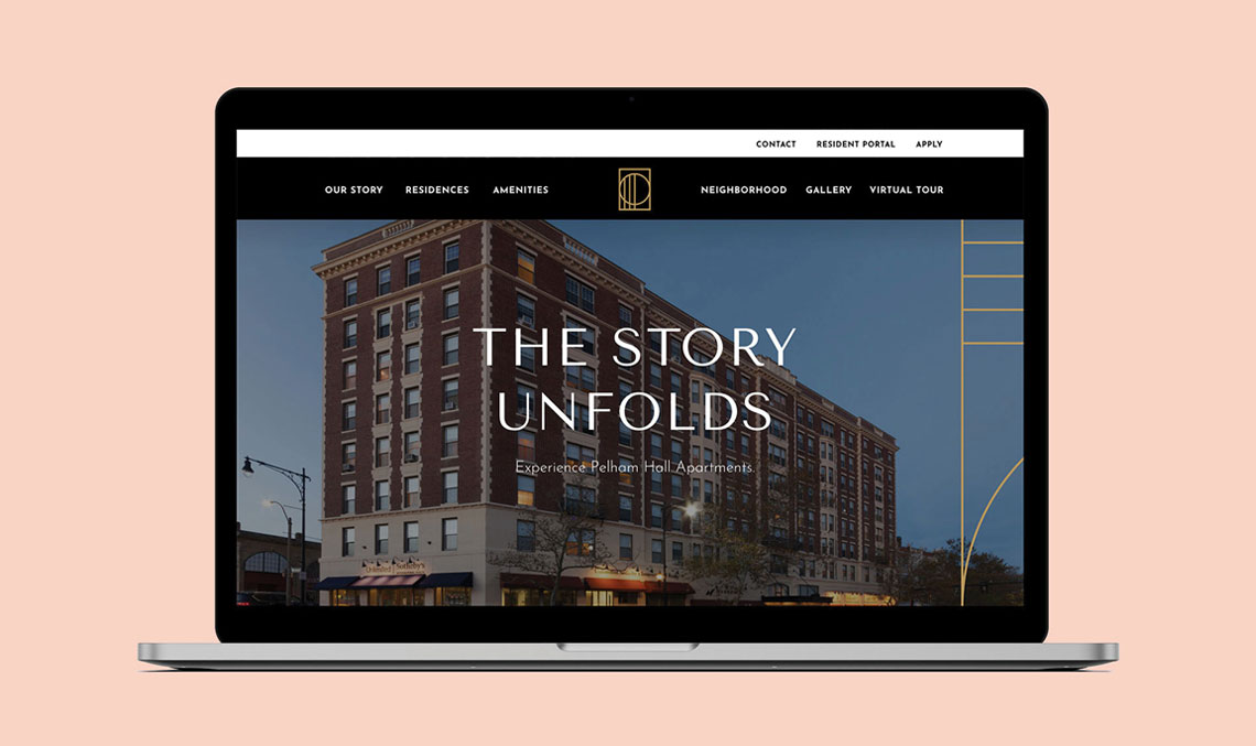
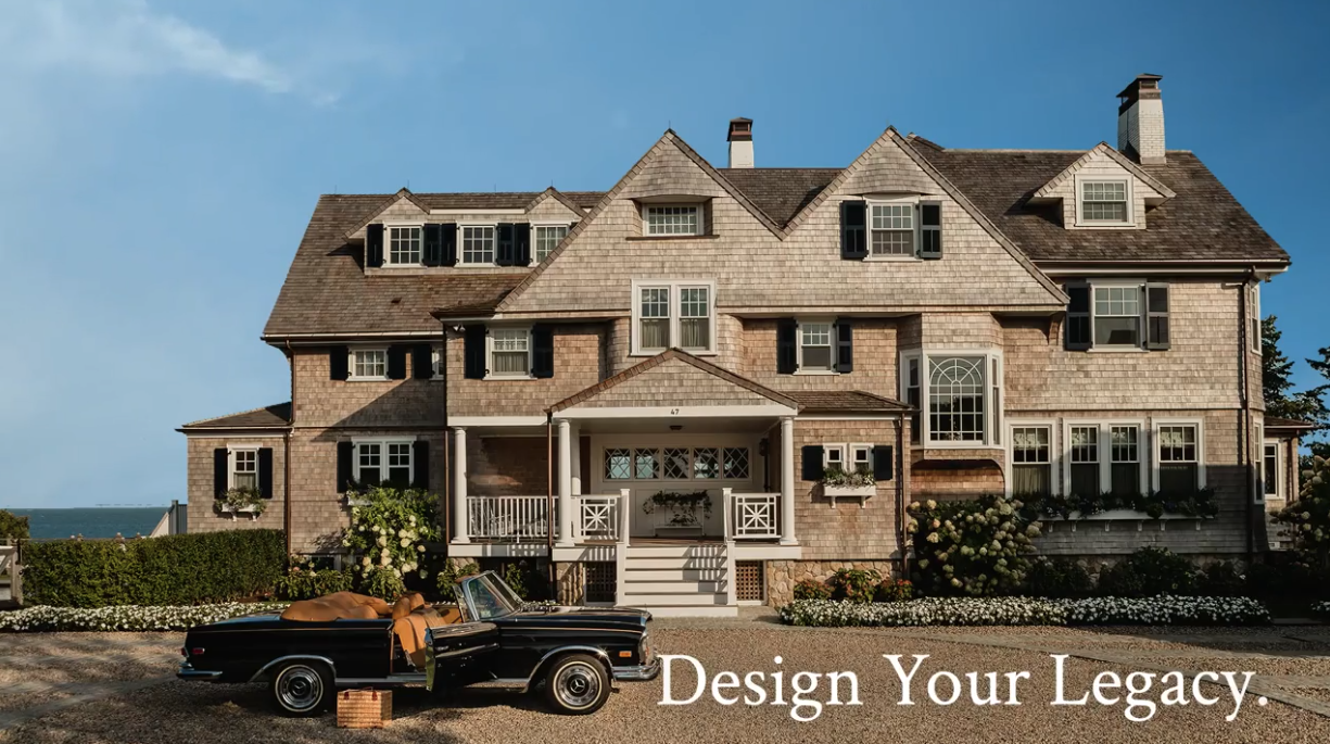
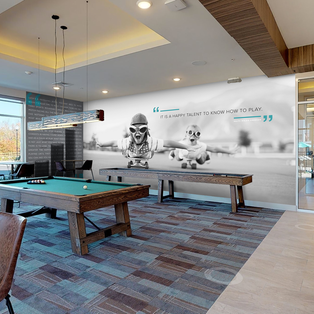
Imagine you’ve purchased or owned a multifamily apartment community that was built when Ross and Rachel were a thing, and it hasn’t been updated since the Friends finale. Updating the clubhouse, investing in state-of-the-art amenities and finishes, and hiring an interior decorator are the obvious fixes. But, just like a tie makes the suit, the Brand Identity of your apartment community sets the tone, providing the flair and personality it needs to stand out in the neighborhood and among the competition. This Brand Identity includes everything from your logo and color palette to your brand positioning and taglines.
Whether you need to create a new brand or update an existing one, your community needs to feel fresh to prospects, but it also needs to feel authentic to the surrounding neighborhood. How do you maintain that local authenticity while creating something new? The answer is a great branding design.
What Is The Rebranding Definition
Why Would A Business Want To Rebrand?
Businesses may choose to rebrand for several reasons, often driven by the desire to remain relevant, competitive, and aligned with their evolving business strategy, values, and target audience. Key reasons for rebranding include:
- Mergers and Acquisitions: When companies merge, or one acquires another, rebranding can help create a unified brand that encapsulates the strengths and offerings of both entities.
- Market Repositioning: If a business wants to target a new market segment or change its position within the market, rebranding can help to realign its brand image and messaging to appeal to the new target audience.
- Clarifying Brand Identity: Over time, a brand’s message may become diluted or confused. Rebranding can help clarify the brand’s identity, values, and unique selling propositions.
- Negative Associations: If a brand has been tainted by controversies, scandals, or negative publicity, rebranding can help distance the company from past issues.
5-Steps To Rebranding Your Business
Step #1: Build A Rebranding Strategy
Who’s your audience? What sets you apart from the competition? What are your goals? These questions and more allow us to gauge exactly what you, the client, are looking for. By answering these types of questions, you provide us with an in-depth understanding of the history and planned future of the community. If we don’t know where you’ve been, how can we help get you to where you’re going?
Step #2: Get Everyone On Board
Next, we set up a call for all stakeholders to elaborate on their questionnaire responses and add any relevant information. It’s essential to do this in a group setting so everyone is aligned on the answers. In the case of some clients, we may involve their interior/exterior designer, who oversees renovations for both communities. We find mood boards to be extremely beneficial, and before we embark, we already have a clear understanding of the vision for the community, ultimately leading us to create branding elements that align with the new renovated look/feel.
Step #3: Get It In A Brief
We’re in the business of creating transformative ideas — ones that change perceptions and attract new audiences. Our Creative Brief helps us get to the big idea that supports the identity when applied to all marketing materials. As our North Star is to be tacked on the wall, the brief provides a framework to define language and color choice and consolidates all of your inputs so we have the right output.
Step #4: Find Your Unique Voice
The approved brief is shared amongst all of our teammates, from our client relations team to the creative team of art directors, designers, and copywriters. This ensures we are all in lockstep to explore solutions that articulate the brand in its best light, knowing that choices in messaging impact choices in art and vice versa.
The target for Vista at Trappers Glen is a young, active audience that enjoys hiking on weekends and the Denver nightlife. This key insight led our copywriter to the positioning line: ‘Adventurous by Nature.’
The Silverlake Apartments was in need of a new name, but our client wanted it to be associated with the neighborhood lake, an amenity for the community. This informed insight inspired the new name, The Lakehouse, and a strong call to action in the positioning line: ‘Meet Us By The Water.’
Step #5: Design (And Design Again)
As the communities’ messaging was under development, our art directors and designers worked through iterations of each logo that followed the positioning lines. For our initial presentation, we present a minimum of three logo concepts to all our clients. After the client approves a general logo direction and positioning line, we then refine them through to completion, adjusting design, color, and tweaking until we’ve reached the final identity and brand voice. Our art directors explain their vision for each community:
Rebranding Examples
Rebranding Logo Examples:
Vista At Trappers Glen
“One of the property renovation goals was to make the community more inviting, encourage an active lifestyle, and foster a sense of shared community space. We captured those goals in an ownable mark that drew inspiration from the Red Rocks area – ideal for an active, outdoor lifestyle and home to some of Colorado’s most beautiful natural landscapes.”
The Lakehouse
“In our visual exploration and research of the Silver Lake area, we discovered the topographical contour map of the lake itself and found that it could serve as a base for a versatile identity that lent itself to all different media. The final logo embodies the lake’s physical dimension but also evokes a sense of rippling water.“
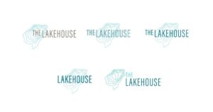
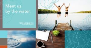
The final identities now apply to the campaign deliverables and can be used on the website, for advertising, and social media. Now, the tie has made the suit and doesn’t feel like Ross’ dinosaur tie.
Rebranding Color Examples:
Airbnb
Background: Airbnb, an online marketplace for lodging, needed a rebranding to reflect its growth, diversity, and the sense of belonging it wanted to promote. Since its inception, Airbnb has grown from a service offering short-term living quarters to a global community platform.

The rebranding introduced a vibrant coral color (Pantone 1785C), a significant shift from their previous blue palette. This coral shade was chosen for its warmth, versatility, and distinctiveness. The color stood out in the digital space where blue was predominant and conveyed a sense of welcome and connection.
The rebranding and especially the new color choice received mixed reviews initially, but it succeeded in making Airbnb more recognizable.
Corcoran Group
Background: The Corcoran Group, known for its luxury real estate services in New York City, the Hamptons, and South Florida, embarked on a rebranding campaign to modernize its image and resonate with a broader audience while maintaining its high-end appeal. The goal was to refresh the brand in a way that reflected its evolution and the modern landscape of real estate.

A key component of Corcoran’s rebranding was the introduction of a new color scheme centered around a sophisticated navy blue, complemented by a palette of softer blues, grays, and whites. The Navy blue was selected for its connotations of trust, reliability, and professionalism, which are crucial in the real estate industry. This color also differentiated Corcoran from competitors who often used black or red in their branding.
The rebranding was met with positive feedback from both clients and industry professionals. The new visual identity helped to solidify Corcoran’s position as a leader in luxury real estate while also making the brand more approachable and relatable to a wider audience.
Who To Contact For Rebranding Services
Whenever rebranding is done right, it can transform a business for the better. But finding the right people to do it can be hard. The experts at Primary360 can help alleviate any worries about making a logo or color scheme that fits the brand image you are looking for. Contact Primary360 today for a consultation!


