
Imagine you’ve purchased or own a multifamily apartment community that was built when Ross and Rachel were a thing, and it hasn’t been updated since the Friends finale. Updating the clubhouse, investing in state-of-the-art amenities and finishes, and hiring an interior decorator are the obvious fixes. But, just like a tie makes the suit, the logo of a multifamily apartment sets the entire tone of the community, providing the flair and personality it needs to stand out in the neighborhood and among the competition.
Whether you need to create a new brand or update an existing one, your new kid on the block needs to feel fresh to renters, but it also needs to feel authentic to the local market. How do you maintain that local authenticity while creating something new? The answer is great design.
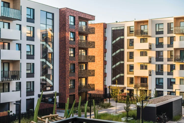
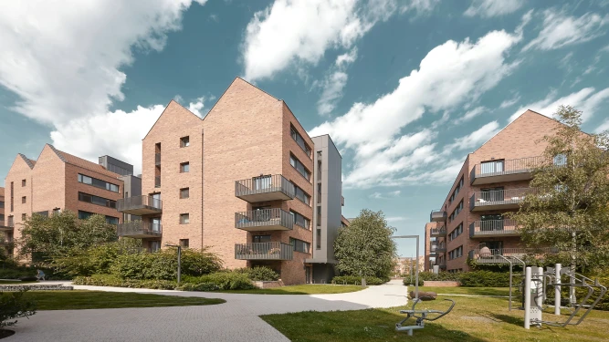
Our client, a private real estate investment company focused on value-add apartment opportunities with a portfolio of thousands of units in secondary western growth markets, came to us with the challenge of rebranding two outdated multifamily communities built in the 90s.
Our makeover to their communities included:
- Rebranding: A new look and feel, logo design, positioning tagline, story, and stationery
- Brand Guidelines: A comprehensive brand book with usage instructions
- Collateral and Signage Design: Brochure, rack card, and labels, markers and directional signs for buildings, apartments, and parking.
To successfully produce these materials, we followed our proven method for multifamily community rebranding, and we’re sharing our 5 secrets so you can produce something new and avoid a rerun.
Too busy to read on?
Secret 1: Do Your Homework
Who’s your audience? What sets you apart from the competition? What are your goals? These questions and more allow us to gauge exactly what you, the client, are looking for. By answering our Rebranding Survey, you provide us with an in-depth understanding of the history and planned future of the community. If we don’t know where you’ve been, how can we help get you to where you’re going?
Secret 2: It Takes a Village
Next, we set up a call for all stakeholders to elaborate on their questionnaire responses and add any relevant information. It’s essential to do this in a group setting so everyone aligns on the answers. In the case of our client, we involved their interior/exterior designer who oversees renovations for both communities. We found her mood boards to be extremely beneficial, and before we embarked we already had a clear understanding of the vision for both communities, ultimately leading us to create identities that matched their new physical appearance.
Secret 3: Get It In a Brief
We’re in the business of creating transformative ideas — ones that change perceptions and attract new audiences. Our Creative Brief helps us get to the big idea that supports the identity when applied to all marketing materials. As our North Star to be tacked on the wall, the brief provides a framework to define language, color choice, and consolidates all of your inputs so we have the right output.
Secret 4: Find Your Unique Voice
The approved brief is handed off from our account strategy team to the creative team of art directors, designers, and copywriters. This team works in lock step to explore solutions that articulate the brand in its best light, knowing that choices in messaging impact choices in art and vice versa.
The target for Vista at Trappers Glen is a young, active audience that enjoys hiking on weekends and the Denver nightlife. This key insight lead our copywriter to the positioning line: ‘Adventurous by Nature.’
The Silverlake Apartments was in need of a new name, but our client wanted it to be associated with the neighborhood lake, an amenity for the community. This informed insight inspired the new name, The Lakehouse, and a strong call to action in the positioning line: ‘Meet Us By The Water.’
Secret 5: Design (and Design Again)
As the communities’ messaging was under development, our art directors and designers worked through iterations of each logo that followed the positioning lines. For our initial presentation, we present a minimum of three logo concepts with all our clients. After the client approves a general logo direction and positioning line, we then refine them through to completion, adjusting design, color, and tweaking until we’ve reached the final identity and brand voice. Our art directors explain their vision for each community:
VISTA AT TRAPPERS GLEN
“One of the property renovation goals was to make the community more inviting, encourage an active lifestyle, and foster a sense of shared community space. We captured those goals in an ownable mark that drew inspiration from the Red Rocks area – ideal for an active, outdoor lifestyle and home to some of Colorado’s most beautiful natural landscapes.”


THE LAKEHOUSE
“In our visual exploration and research of the Silver Lake area, we discovered the topographical contour map of the lake itself and found that it could serve as a base for a versatile identity that lent itself to all different media. The final logo embodies the lake’s physical dimension but also evokes a sense of rippling water.“


The final identities now apply to the campaign deliverables and can be used on the website, for advertising, and social media. Now, the tie has made the suit and doesn’t feel like Ross’ dinosaur tie.